

Worth a Thousand Words
-
 John Mauldin
- |
- November 26, 2021
- |
- Comments
- |
- View PDF
 John Mauldin
Happy Thanksgiving! I hope everyone had a good holiday. I’m writing this issue early in the week while enroute to join family in Dallas. Today will be different and I hope you like it.
The charts and comments below are drawn from the “Clips That Matter” feature of our Over My Shoulder service. Because we know a picture is worth a thousand words, my co-editor Patrick Watson and I select a few important charts and graphics and send them to subscribers each week with some brief comments. Many say these clips are their favorite part of the service.
Please enjoy, and I’ll have a few more words afterward.
COVID Retirement Boom
“Where did all the workers go?” is a recurring question lately. This chart has a partial answer. The blue line shows retirees as a percentage of the US population. As you would expect, it turned higher after the first Baby Boomers turned 65 in 2010. The red dotted line shows the smoothed trend for that period.
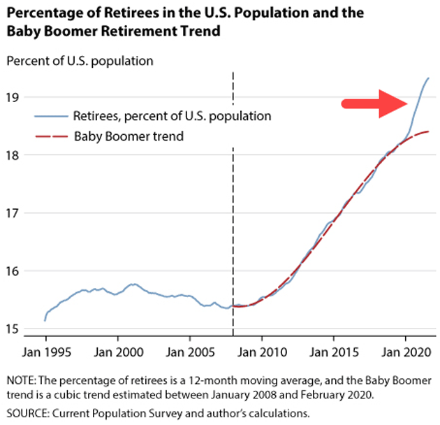
Source: Federal Reserve Bank of St. Louis
Then came 2020, and we see by the red arrow the percentage of retirees rising sharply above the previous decade’s trend. COVID-19 appears to have motivated a bunch of early retirements, which seem to be accelerating. Everyone has their own reasons, but we suspect this isn’t entirely health concerns. Some retirees probably saw big portfolio gains as markets surged, and decided they could afford to retire earlier than planned.
The percentage may look small, but this divergence represents something like 3 million “excess retirees” above what the prior trend predicted. That’s substantial labor force shrinkage.
Massive Distortions
The common thread between rising inflation and growing supply chain problems seems to be increased US consumer goods demand. People want to buy more stuff because they have higher incomes. This chart illuminates the timing of recent income growth.
We can see that real disposable personal income was rising at a generally steady pace in the years leading up to 2020. Then came the pandemic, after which we see three sharp income peaks. These coincide with the three rounds of stimulus payments most Americans received, the first in 2020 and two more in early 2021.
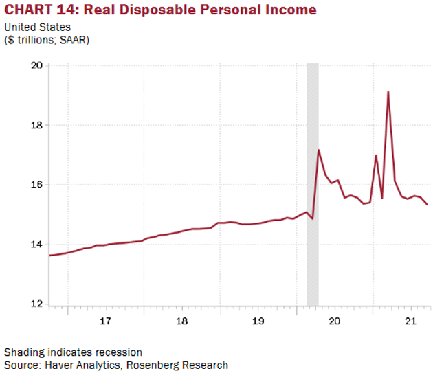
Source: Rosenberg Research
Disposable income dropped after all three payments but far faster in the two 2021 installments. The last few months show it roughly back to the pre-COVID trend.
If personal income goes back to this pace, the supply chain problems and inflation may also recede. For now, we can only observe massive distortions, with consequences not yet fully understood.
Gas x 42
You may have noticed rising gasoline prices this year. This is a function of rising crude oil prices, since gasoline is refined from oil. In theory, the two prices don’t necessarily move together. Yet one simple trick produces a chart showing their close connection. Simply divide crude oil’s price by 42 and plot it against the US average gasoline price, and you get this.
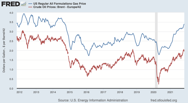
Source: Paul Krugman
Look closely and you can spot short periods when they diverged, but over time the two series have moved mostly in tandem.
Technically minded investors may notice one possibly important difference, though. Crude oil seems to be encountering resistance near its last peak just before the COVID recession. Meanwhile gasoline broke through its 2018–2019 highs several months ago. That could be significant, but exactly how remains to be seen.
Car Buyer Confidence
Speaking of sharp divergences, here’s a doozy. Each month for decades, University of Michigan surveys have asked consumers if they think now is a good time to buy a car. The latest data shows a sharp decline in confidence.
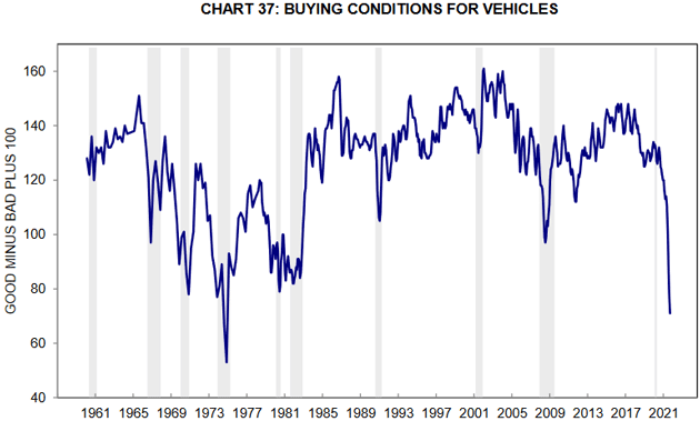
Source: University of Michigan
You can see such declines happened before. In every case they coincided with a recession, until now. Now consumers are losing confidence a year after the brief COVID recession ended.
The difference may be that the survey question doesn’t identify why people think it is a bad time to buy cars. In today’s context, it may be because they’ve tried to buy a car and couldn’t find the model they wanted, due to microchip shortages and other logistical issues. Confidence may return once inventories normalize. But it’s hard to know when that will be.
Poverty Lines
Like what you’re reading?
Get this free newsletter in your inbox every Saturday! Read our privacy policy here.
This map shows US poverty by state. The colors indicate the percentage of each state’s population below the federal poverty line. The least-impoverished state is New Hampshire while Mississippi is the poorest.
But as with inflation and other stats, this raises measurement issues. For one, it doesn’t consider cost of living. High-cost places like California and Hawaii may have more struggling residents than their poverty rate suggests. Nevertheless, the map shows yet another way in which the US remains sadly divided.
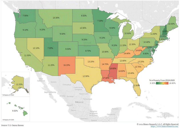
Source: Bianco Research
Household Deleveraging
We know debt grew sharply since COVID struck, and not by accident. Federal Reserve policy was explicitly designed to encourage debt. This chart shows how well it worked, at least relative to GDP.
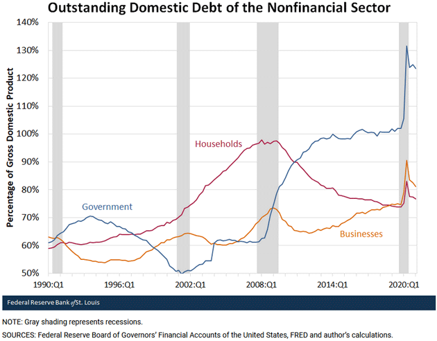
Source: Federal Reserve Bank of St. Louis
Looking at the right-hand side, you can see government, household, and business debt shot higher in 2020. Government debt rose far more and has receded much less. Business debt, even after a pullback, is still far above the pre-pandemic level.
The most interesting part is household debt. It didn’t jump as much, has now pulled back toward the prior trend, and is still far lower than it was in the financial crisis years—during which the government and businesses had far more debt.
Households spent the last decade steadily deleveraging, and COVID looks like only a temporary distraction. That’s not the case with business debt and certainly not government debt. Those are the problems now.
Default Warning
Remember the debt ceiling? We avoided a crisis when Congress extended it in October. Treasury Secretary Janet Yellen estimated last week the debt will again reach the limit on December 15. Bond traders noticed, as this chart shows.
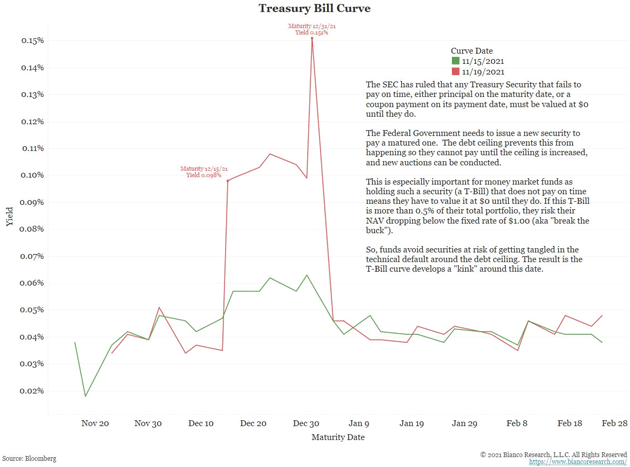
Source: Bianco Research
The green line shows Treasury bill yields on November 15, before Yellen’s statement. The red line shows yields a few days later. They spiked higher for bills maturing after mid-December. That reflects the small but significant risk Treasury will be late to repay those debts.
This is a potentially wider problem that could force money market funds to mark down some of their Treasury bill holdings and maybe even “break the buck.” But it’s also easily avoidable if Congress acts before the deadline. We suspect that will happen, but there’s no guarantee.
Recession Ratio
The Conference Board publishes several popular indexes like Leading Economic Indicators. Their Coincident Economic Indicators index is less well-known. Unlike LEI, which tries to project future conditions, CEI looks at current conditions. But the ratio of both indexes may be even more useful.
This chart shows LEI/CEI tends to start falling a few months before a recession begins. Since 1969 it signaled them 2–9 months in advance. There were also some false alarms, but sharp downturns seem to be a pretty reliable indicator. As of now this ratio is still rising, so recession doesn’t look like a near-term risk.
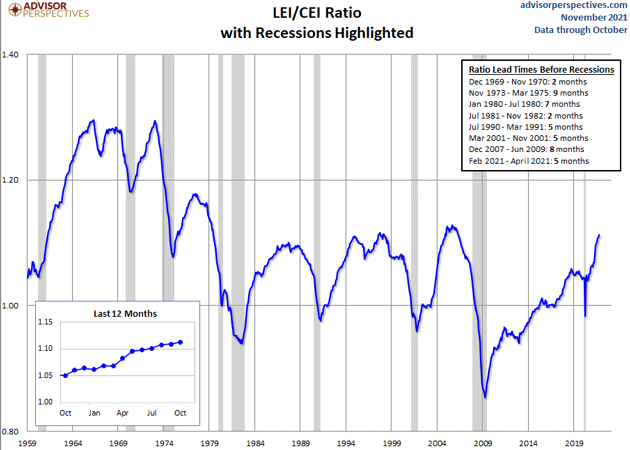
Source: Advisor Perspectives
Home for the Holidays
I am writing this from the airport lounge on Monday as I leave for Dallas. I’m filing early while the Mauldin Economics production staff takes a well-deserved long weekend. Shane and I will already be back home in San Juan by the time you read this. Barring some last-minute trip somewhere, we are home for the holidays.
Because of COVID, it has been a long time since I have seen all my kids, except when they come to see us. I will be up early (at least for me) on Thursday cooking prime rib with my special rub and mushrooms and a few sides, but my grown children now all bring something. Looks like we will have to feed almost 40. The prime they sent me a picture of is HUGE! At 20 minutes a pound, this one may take four hours.
I am thankful for so many things, and one of them is you. Truly, writing this letter is such a joy because of all the feedback I get wherever I go and through emails. It is a small way to make a difference.
Have a great week!
Your likely 4–5 pounds heavier today than last Monday analyst,

John Mauldin
P.S. If you like my letters, you'll love reading Over My Shoulder with serious economic analysis from my global network, at a surprisingly affordable price. Click here to learn more.
Tags
Suggested Reading...
|
|


Did someone forward this article to you?
Click here to get Thoughts from the Frontline in your inbox every Saturday.
