
12 Charts That Show Why A 60% Drop In Equities Is Very Real
- John Mauldin
- |
- April 12, 2017
- |
- Comments
BY JOHN MAULDIN
A few weeks ago, I spent two days giving multiple speeches alongside my friend Steve Blumenthal of CMG in New Jersey. I listened to Steve do deep dives on stock market valuations.
Steve puts a great deal of research into the topic, so I asked if he could share some data from time to time, and he agreed. With his help, I compiled valuation measurements used by people who know what they’re talking about.
Not surprisingly, they all point to the fact that equities are pricey. But what is surprising is the degree of overvaluation—we are talking about the risk of a 60% decline.
Below are 12 charts that paint the whole picture best. Let’s jump in.
Shiller’s CAPE (Cyclically Adjusted P/E)—A Measurement Process That Smooths P/E Over The Last 10 Years
The current Shiller’s CAPE P/E is 28.94, higher than at the market high in 2007, and higher than the bull market peak in 1966. Only 1929 and 2000 were higher.
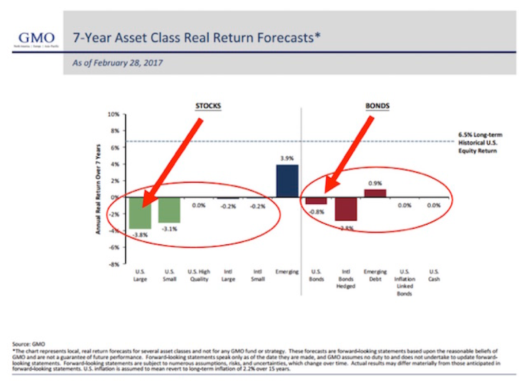
Jeremy Grantham: GMO’s 7-Year Asset Class Real Return Forecast
Here’s how to read the chart:
- GMO published these forecasts each month. There has been a high correlation over time between what GMO predicted and what turned out to be. An approximate 0.97 correlation, actually. That’s as close to the middle of the fairway as any forecaster has hit the ball, as far as I know, which is why you really need to take this forecast seriously.
- As of February 2017, GMO is forecasting a -3.8% annual return for US large-cap equities and a -0.8% for US bonds over the coming seven years.
- With a richly priced market (expensive hamburgers) and GMO’s strong return forecast history, we find it illogical and unwise to chase into passive buy-and-hold ETFs and index funds at this time. Yet, that is what is happening.
Hussman’s 12-Year Return Forecast: 0–2% Returns Before Inflation
John Hussman shared this next chart, and it shows that his 12-year forecast is for 0% to 2% returns before inflation.
This is a portfolio based on 60% equities, 30% Treasury bonds, and 10% Treasury bills. Basically, a typical 60/40 portfolio. Question: Do you really think there will be 0% inflation over the next 12 years?
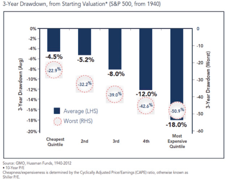
This Chart Predicts An Up To 51% Decline During A Recession
When valuations are highest, not only are returns lowest, but risk is highest.
This chart shows that from where we are today, we should expect an 18% drawdown in an average case and a worst-case -51% if there is a recession (more recession probabilities in a moment).
Household Equity Ownership Percentage vs. Subsequent Rolling 10-Year S&P 500 Index Total Returns
This next chart shows that household equity ownership percentage has a high correlation with future annualized returns. Here’s how you read the chart:
- Think in terms of buying power. If individuals are fully invested in stocks, how much more money do they have available to buy more stocks? More buyers than sellers pushes prices higher. More sellers than buyers pushes prices lower.
- Of course, there are other buyers and sellers: institutions, corporations, and foreign investors (and now even government central banks). Just stick with us at this point.
- The blue line tracks the percentage of total household financial assets that are equity investments, including mutual funds and pensions.
- Take a look at the top red arrow. At the market top in March 2000, the high level of equity ownership was forecasting a return of -3% annualized over the coming 10 years.
- The black dotted line plots total return over the subsequent 10 years, on a rolling basis.
- Again, focus in on 2000. The dotted black line shows that total return over the following 10 years turned out to be approximately -1%.
- Look how closely the dotted black line tracks the blue line over time.
We can use this chart as a guide. We will share it with you from time to time. The point is that we want you to be prepared to overweight stocks when the getting gets good. The hard part is that you’ll need to be a buyer when everyone around you is panicking.
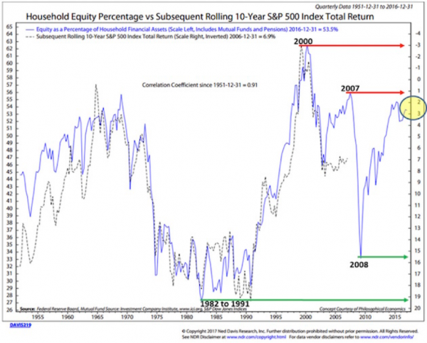
That’s when opportunity is always best. But for now, if you are betting that we’re at the beginning of a new bull market, you are really expecting this time to be different.
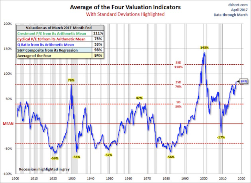
Average Of Four Valuation Indicators—Way Above Trend
Here’s how you read this next chart:
- The chart is a simplified summary of valuations obtained by plotting the average of four arithmetic series. It also shows standard deviations above and below the mean.
- Standard deviation measures extreme moves away from normal trend.
- The four valuation metrics are the Crestmont PE, the cyclical PE10 (similar to the Shiller PE), the Q ratio, and the S&P composite from its regression.
- Note the far-right number on the chart: 84%. That’s our current valuation, and it’s two standard deviations above trend—the second-most overvalued reading in the data series history.
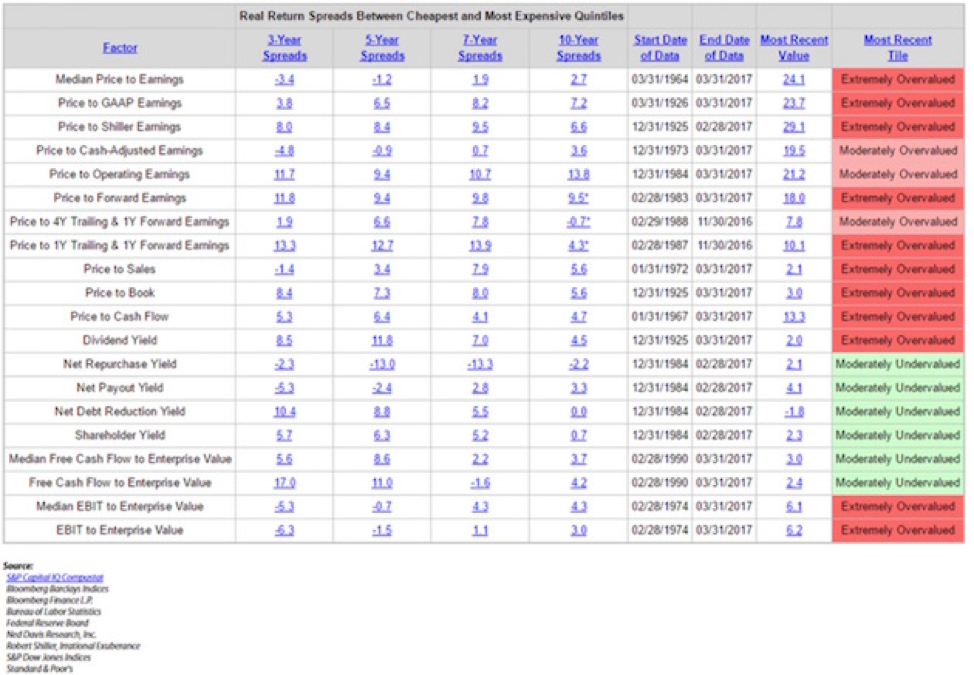
Everything Else—Price-to-Sales, Price-to-Operating Earnings, Etc.—Scream “Extremely Overvalued”
The chart below looks at 20 different ways you can value the stock market. Note that it is possible to come up with valuation metrics that show the market to be moderately undervalued. Most of those methodologies have something to do with yield.
That being said, look to the far right—most valuation metrics are “Extremely Overvalued.”
Median P/E Predicts Dismal 10-Year Returns
(This next section is basically from Steve, triggered by a discussion he had with a reporter from a mainstream media business journal. The journalist was struggling to understand the concept of projecting future returns based on current P/E ratios. Steve gave her the following chart.)
To make this discussion a little more real, I selected several dates to give you an idea as to what the median P/E was then and what the subsequent annualized 10-year return turned out to be.
- Green is low P/E, high subsequent returns
- Red is high P/E, low subsequent returns
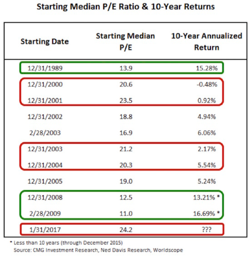
Take a look at the December 2002 median P/E of 18.8. A month prior—on November 11, 2002—Warren Buffett said, “The bubble has popped, but stocks are still not cheap…” He was right.
The return over the subsequent 10 years was just 4.94%. Gentle readers, we sit at a median PE of 24.2 today—higher than at any other point in the above chart. Caution!
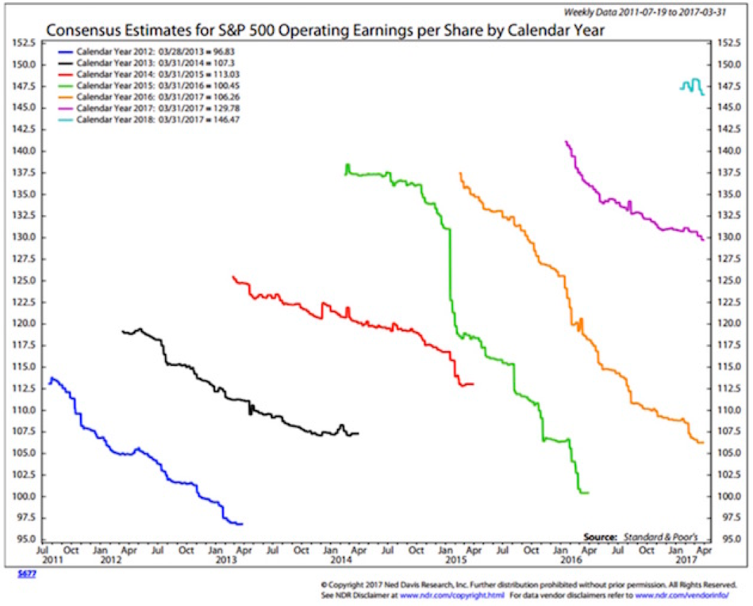
These Two Charts Show How Bad Wall Street Overshoots With Its Estimates—And They Still Haven’t Learned The Lesson
We use median P/E because analysts have historically been too optimistic in their earnings forecasts. This is why we don’t—and don’t believe you should—trust Wall Street estimates. Here’s how you read the chart:
- The upper end of each squiggly line is the first Wall Street consensus estimate; the bottom of each line is the last.
- Note that for 2016 (the orange line), the first estimate was for $137 earnings per share on the S&P 500 Index, and the last was for $106. That’s a big miss.
- Also note that 2016 may end lower than the actual earnings for 2013 (the black line).
Now, here is another way to look at that same data from Crestmont Research. What the next chart shows is that the earnings per share for 2016 dropped to $94.55, which is indeed lower than for 2013 and 2014! The initial forecast for 2016, 24 months ago, was for earnings to be $124.20.
And as Ed Easterling has noted, the analysts haven’t learned anything: They are starting their predictions for 2018 at well over $130 (upper-right small squiggle). Already, 2017 forecasts are down $10 from the original predictions and are on target to be close to the earnings for 2016!
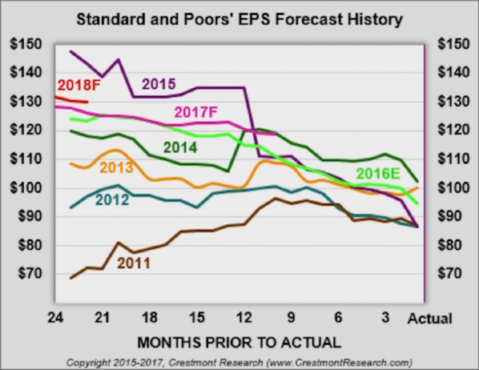
Earnings have been basically flat for the last three years and haven’t really improved all that much in the last six years, and yet we are in a serious cyclical market. The last three years have seen the market rise by over 50% with no earnings increase.
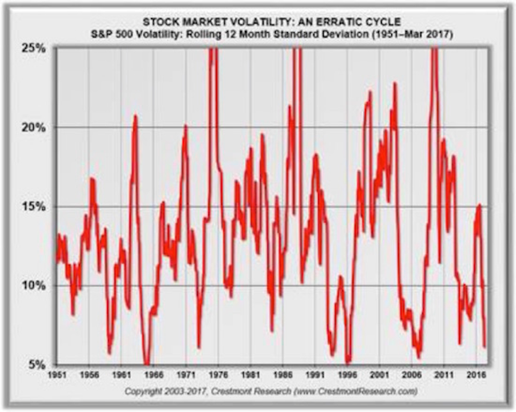
And Now Volatility Drops To Record Lows…
And on top of all that exuberance, volatility has now plunged to 4%—the lowest level in all rolling 12-month periods since 1950.
The Last Chart Reminds Us That Bull Markets Go Out With A Bang
This chart is almost self-explanatory. Look at the numbers in the boxes outlined in black, which show the final-year performance in every cyclical bull market since 1947.
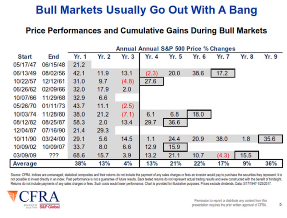
They typically end with a great final blow-off year. Which is precisely what leads investors to pile ever more frenetically into the market, convinced once again that this time is truly different. Doesn’t this sound familiar to you?
Get a Bird’s-Eye View of the Economy with John Mauldin’s Thoughts from the Frontline
This wildly popular newsletter by celebrated economic commentator, John Mauldin, is a must-read for informed investors who want to go beyond the mainstream media hype and find out about the trends and traps to watch out for. Join hundreds of thousands of fans worldwide, as John uncovers macroeconomic truths in Thoughts from the Frontline. Get it free in your inbox every Monday.