
Here’s the Reason Active Funds Can’t Beat Passive Funds—and It Worries Me a Lot
- John Mauldin
- |
- June 15, 2017
- |
- Comments
BY JOHN MAULDIN
I’ve touched on the issue of passive investing quite a few times. But this time, I want to show a few charts that illustrate the extent of the problems that are building up in the passive index world.
It is not just ETFs, but also index mutual funds and the enormous amount of pension and insurance funds, along with many trust funds, that are passively invested directly in stocks. They simply duplicate indexes.
Let’s dive in!
Vanguard Owns More Than 5% of 468 Stocks in the S&P 500
First, let’s note that Vanguard now owns more than 5% of 468 stocks in the S&P 500. That’s one fund company.
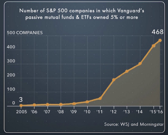
Source: WSJ
The Reason Active Funds Are Dying out
The number of hedge funds is at its lowest level since 2000. Passive funds are eating away at the assets under management by active funds:
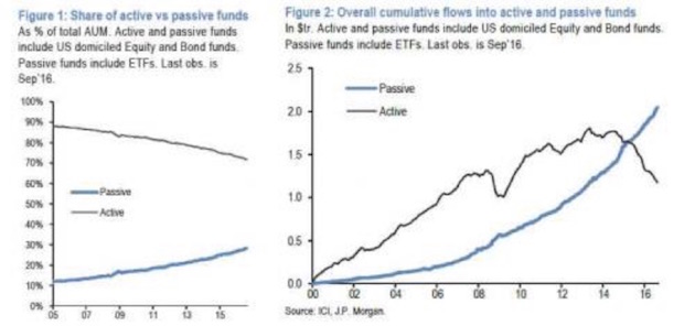
Source: JP Morgan
This trend goes back to a point I made a few weeks ago but that needs to be repeated again and again. When the market obscures distinctions between good stocks and bad stocks because it buys all of them at the same time, there is no way for an active manager to take advantage of his skill in determining value.
That ability to look at a company’s balance sheet and determine something close to true value is what gives active managers their edge. If you don’t have the chance to do this, you cannot add any alpha, and you are going to underperform the simple passive indexes—even though you charge higher fees.
Money will leave you for the seemingly more plentiful pastures of passive indexing. One day you will be vindicated, and the money will come back (think Jeremy Grantham), but because investors will lose a great deal of their money in a bear market, you won’t get as much back in the short term as left you over the past few years.
If you are an active manager, this just sucks.
The Picture Is Even Gloomier in Retail Funds
The next two charts show the difference between active and passive investing in the retail fund space. It’s a huge contrast:
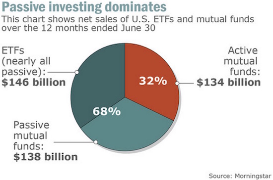
Source: Morningstar
The chart below traces the widening imbalance since 2008.
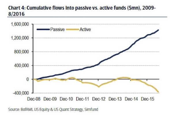
Source: Simfund
As I stated above, this imbalance will eventually be corrected. But the correction will not be pretty, though it may be swift.
If I’m going to keep my pledge to be shorter, more thoughtful, and faster, then I’d better close on that note.
Get a Bird’s-Eye View of the Economy with John Mauldin’s Thoughts from the Frontline
This wildly popular newsletter by celebrated economic commentator, John Mauldin, is a must-read for informed investors who want to go beyond the mainstream media hype and find out about the trends and traps to watch out for. Join hundreds of thousands of fans worldwide, as John uncovers macroeconomic truths in Thoughts from the Frontline. Get it free in your inbox every Monday.