
These 4 Maps Show The Geopolitical Hotspots of 2017
- George Friedman and Jacob L. Shapiro
- |
- January 20, 2017
- |
- Comments
BY GEORGE FRIEDMAN AND JACOB L. SHAPIRO
In geopolitics, a deep understanding of geography and power allows you to do two things. First, it helps you comprehend the forces that will shape international politics and how they will do so. Second, it helps you distinguish what is important from what isn’t.
This makes maps a vital part of our work, here at This Week in Geopolitics (subscribe here). So we have decided to showcase some of the best maps our graphics team (TJ Lensing and Jay Dowd) made in 2016.
These four maps help explain the foundations of what will be the most important geopolitical developments of 2017.
Map 1: Russia’s economic weakness
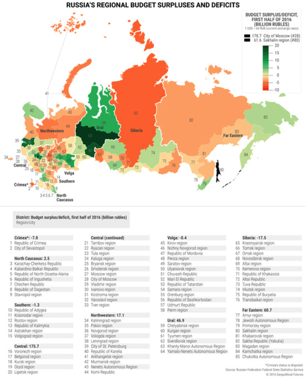
This map shows three key aspects to understanding Russia in 2017. (For my full 2017 geopolitical forecast for Russia, click here.)
First is the oft-overlooked fact that Russia is a federation. Russia has a strong national culture, but it is also an incredibly diverse political entity that requires a strong central government. Unlike most maps of Russia, this one divides the country by its 85 constitutive regions. (87 if you count Crimea and Sevastopol.) Not all have the same status—some are regions, while others are autonomous regions, cities, and republics.
The map also highlights the great extent of economic diversity in this vast Russian Federation. The map shows this by identifying regional budget surpluses and deficits throughout the country. Two regions have such large surpluses that they break the scale: the City of Moscow and Sakhalin. Fifty-two regions (or 60% of Russia’s regional budgets) are in the red. The Central District, which includes Moscow, makes up more than 20% of Russia’s GDP, while Sakhalin and a few other regions that are blessed with surpluses produce Russia’s oil.
The third point follows from the first two. Russia is vast, and much of the country is in a difficult economic situation. Even if oil stays around $55 a barrel for all of 2017, that won’t be high enough to solve the problems of the many struggling parts of the country.
Russian President Vladimir Putin rules as an authoritarian. This is, in part, because he governs an unwieldy country. He needs all the power he can get to redistribute wealth so that the countryside isn’t driven to revolt.
Russia is making headlines right now because of Ukraine, Syria, and alleged hacking. But the geopolitical position of Russia is better described by studying the map above.
Map 2: China’s cage limits access to the Pacific
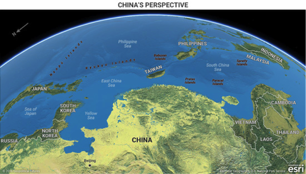
Maps that shift perspective can be disorienting, but they are meant to be. Our minds get so used to seeing the world in one way that a different view can feel alien. But that is even more reason to push through the discomfort. The map above shows us the Pacific from Beijing’s perspective.
China's moves in the South China Sea have received a great deal of attention. In a Jan. 12 confirmation hearing with Congress, nominee for US Secretary of Defense James Mattish pointed to Chinese aggressiveness as one of the major reasons he thinks the world order is under its biggest assault since World War II.
But we believe the Chinese threat is overstated. This map helps explain why.
China’s access to the Pacific is limited by two obstacles. (I wrote about this extensively in This Week in Geopolitics… subscribe here for free). The first is the small island chains in the South and East China Seas. When we look at this map, China’s motive in asserting control over these large rocks becomes clear. If China cannot control these islands and shoals, they can be used against China in a military conflict.
The second obstacle is that China is surrounded by American allies. Some such as Japan (and to a lesser extent South Korea and Taiwan) have significant military forces to defend themselves from Chinese encroachment. Taiwan sticks out as a major spur aimed squarely at China’s southeast coast. Those that don’t have sufficient military defenses, like the Philippines, have firm US security guarantees. China is currently at a serious geographic disadvantage in the waters off its coast.
This map does not reveal one important fact. That is the US Navy outclasses the Chinese navy in almost every regard… despite impressive and continuing Chinese efforts to increase capabilities.
But looking at this map, you can see why China wants to make noise in its coastal waters and how China is limited by an arc of American allies. You can also see why one of China’s major goals will be to attempt to entice any American allies to switch sides.
China’s moves regarding the Philippines will require close observation in 2017.
Map 3: Geographical power in the Middle East
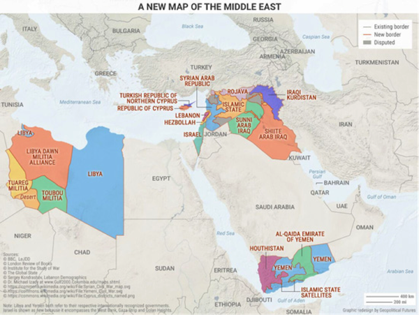
It has become cliché to point out that the Middle East’s current political borders were drawn after World War I by colonial powers (like the UK and France), and that the region’s recent wars and insurrections are making these artificial boundaries obsolete. What isn’t cliché is doubling down on that analysis.
We’ve drawn a new map… one that reveals what the Middle East really looks like right now. Some will object to some of the boundaries for political purposes, but this map is not trying to make a political statement. Rather, it is an attempt to show who holds power over what geography in the Middle East.
From this point of view, Syria, Iraq, Yemen, and Libya no longer exist. In their places are smaller warring statelets based on ethnic, national, and sectarian identities. Other borders (like those of Lebanon and Israel) are also redrawn to reflect actual power dynamics.
Here, a politically incorrect but accurate map is more useful than an inaccurate but politically correct one.
It is also important to note which countries' borders do not require redrawing. These include three of the region’s four major powers: Iran, Turkey, and Saudi Arabia. The borders of the other major power, Israel, are only slightly modified. (Egypt is an economic basket case. It doesn’t qualify as a major power, even though it has one of the most cohesive national cultures in the Arab world.)
The Middle East is defined by two key dynamics: the wars raging in the heart of the Arab world and the balance of power between the countries that surround this conflict.
Map 4: Nationalism and the future of the EU
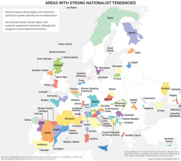
Analyzing this map must begin with a disclaimer: This is a tool and a means of thinking about Europe’s future… not a prediction of what Europe’s borders will look like in the future.
The map identifies areas in Europe with strong nationalist tendencies. The names of regions with active separatist movements are not italicized. Those that are italicized are demanding increased autonomy but not independence. The point here is not their size, but rather in all these regions, there is some degree of national consciousness that is not consistent with the current boundaries of Europe’s nation-states.
The European Union is a flawed institution because its members could never decide what they wanted it to be. European nation-states gave up some of their sovereignty to Brussels… but not all of it. So when serious issues arose (such as the 2008 financial crisis or the influx of Syrian and other refugees), EU member states went back to solving problems the way they did before the EU.
In 2016, Brexit shook the foundations of the EU. And in 2017, elections in France and Germany as well as domestic instability in Italy will shake those foundations once again.
But Brexit also brings up a deeper question: How will national self-determination be defined in the 21st century? Not all of Europe’s nation-states are on stable ground. The most important consequence of Brexit may be be its impact on the political future of the UK itself. And in Spain, Catalonia already claims it will hold an independence referendum this year.
Brussels, meanwhile, keeps trying to speak with one voice. This map shows exactly how hard that is… not just for the EU, but also for some of Europe’s nation-states. I wrote extensively about these challenges (and more) in my recent 2017 geopolitical forecast for Europe, click here.
Conclusion
The saying goes that a picture is worth a thousand words. Maps are worth many more. Our perspective on the world is rooted in an objective approach to examining geography and power. These four maps are essential tools for thinking about the geopolitical forces that will shape the world in 2017.
Prepare Yourself for Tomorrow with George Friedman’s This Week in Geopolitics
This riveting weekly newsletter by global-intelligence guru George Friedman gives you an in-depth view of the hidden forces that drive world events and markets. You’ll learn that economic trends, social upheaval, stock market cycles, and more… are all connected to powerful geopolitical currents that most of us aren’t even aware of. Get This Week in Geopolitics free in your inbox every Monday.